Tuesday, June 5, 2012
Tuesday, May 29, 2012
Day Ten

This is the last of ten projects. The prompt was something that we wouldn't want to get in the mail. I think this would be pretty scary if I saw this when I opened my mailbox.
Thursday, May 24, 2012
Day Nine

I made a sunflower in the literal sense of the word with a picture of the sun, a bunch of flames, and a flower stem. I positioned it in the flower field so that it was almost in the sky like the sun.
Day Eight

This was really easy. We were supposed to make a sign that was scary so here ya go.
Day Seven

This was for the collaboration between Kangaroo Express and Apex High. Kangaroo was nice enough to give Apex students free Roocups as part of their launch this year! With a roocups you can get 25 cent sodas and slushies all summer long, so it's really awesome. Since our mascot is the cougar, I thought I'd photoshop an adorable baby cougar sipping on a Roocup.
Day Six
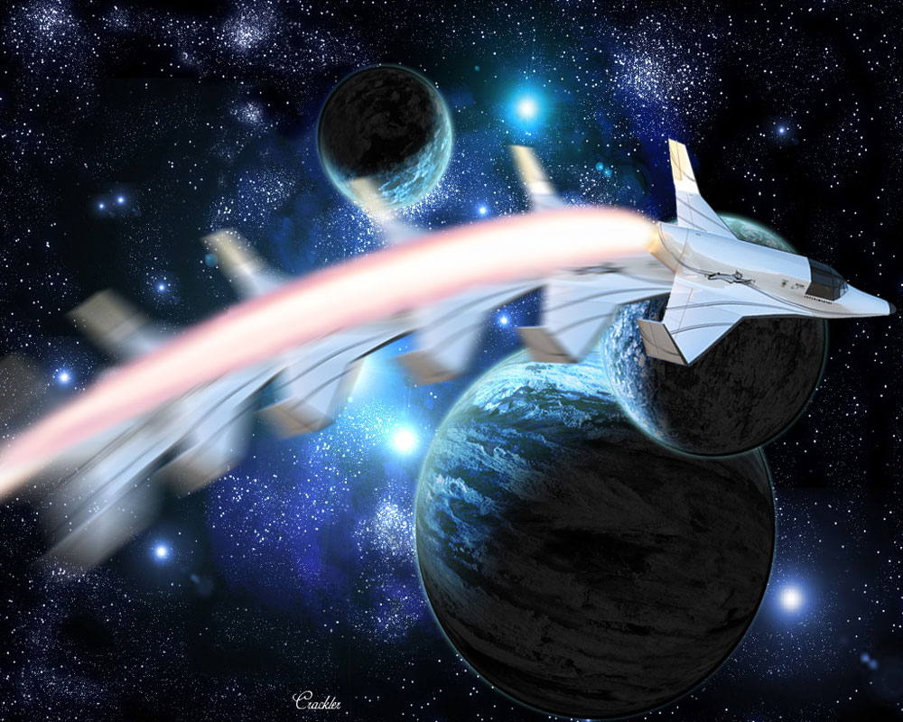
I used motion blur for the rockets and the warp tool for the exhaust. Cool background courtesy of Google images.
Thursday, May 17, 2012
Day Five

It's like one of those hand puppets you draw on with sharpie to make talk, but with with actual eyes, eyebrows, and a mouth.
Day Four

This was superrrr easy but it looks pretty cool. I used photoshop's masking to do this.
Here's one with some layer style effects added:

Tuesday, May 15, 2012
Day Three

Sooo...Pulp Fiction...get it? Pulp?? Cuz she's holding orange juice and orange juice is...pulpy..haha..ha........yeahh.
Monday, May 14, 2012
Day Two

Here is Rapunzel from Tangled as Catwoman from Batman. Since Catwoman has a whip it reminded me of Rapunzel's hair, although Wonder Woman has a lasso so that could have worked too...oh well. I had to get rid of her dress and some of her hair to get her Catwoman outfit to fit right and I added heels too.
Thursday, May 10, 2012
Day One

I guess you really are what you eat! This little mouse has been found to be made of cheese. Project for day one of "The Twelve Days of Photoshop" in Mr. Sands' class.
Monday, May 7, 2012
Duckie!!

Illustrator Flowers :)

Tuesday, May 1, 2012
twirly

Well I should have taken more pictures so it wasn't so choppy....and I'm still not quite sure on how to erase without messing everything up and/or making it all super tedious. But they're still cute and I'll hopefully do more in the future that are better than these.
Tuesday, April 24, 2012
Unicorn :D

This was really time consuming but it's pretty cool. I drew out several unicorns and then edited them after scanning them in. The background part was really time consuming and I wish there was a way to make it look more realistic but I am not aware of any. I used a picture of gold bars to do the hooves and horn and made it embossed using layer style.
My Mom is an Elf

I photoshopped my mom to be an elf. It took a while and was pretty hard but still super fun.Getting the ear to match the face was probably the hardest part. I wanted to add even longer hair than I already did, but I wasn't sure how to do it...anyways...I'll probably do more elf pictures in the future.
Thursday, March 22, 2012
Flower Power

So we took a picture of flower, made it into a brush, and then adjusted the options. This is what I ended up with and I think it's really pretty. Though I absolutely love pink and black together so I may be a little biased... I think I'll have a lot of fun making new brushes in the future now that I know how to do it!
Tuesday, March 20, 2012

Thursday, March 15, 2012
Music is from the Heart

I like this one because it ended up actually looking like objects, which I was kind of worried about. Looks a little like something drawn on a chalkboard. It was pretty hard but not nearly as hard as i thought it would be, and it was actually really fun. However, every time you warp the words, they get fuzzier and fuzzier so it was kind of difficult to keep the words looking similar.
Wednesday, March 14, 2012
Papa Bear
Yes, you saw right. The bear is break dancing. It is stop motion soooo it's a little slow. But his freeze at 7 seconds is pretty sick. This was a really tedious project but it's ok because it's cute.
Wednesday, March 7, 2012
Kind of immoral?


More Retouching:
It kind of feels weird editing this really pretty girl, making her even more skinny than she already is. I believe that it reflects the impossible standard held by society for what is considered beautiful. However this was a very good learning experience and I think I did pretty well. One thing I wasn't happy with was her jaw and chin. In the process of attempting follow the direction of slimming her jaw, I ended up making her chin look bigger and now her face looks slightly off center. I also wasn't really sure how to actually make her legs longer. The hardest part was getting rid of the black markings and trying to liquefy her waist without screwing up her arms.
Tuesday, March 6, 2012
Fixing their faces...
Before After


My first two attempts at retouching. Not too shabby. Each time I learned more about how I could use the tools to make things easier or look better. I tried really hard to make them look as natural as possible and I hope it shows. The hardest part on the first one was probably getting the skin's to look normal and not splotchy and the hardest part of the second was retouching the lower part of her cheek. Also I didn't blend between the cheek and ear on the first one very well.
Wednesday, February 8, 2012
Pretty Colors

So I used a flute again. I think it looks pretty cool; kind of like the spokes of a wheel. This is not your typical color wheel. It is the RGB Color Wheel, which is the one that shows the mixture of colors in light rather than pigments. On the computer, colors mix like the light rather than paint so mixing red and green will get you yellow, not some weird dull icky color like paint. I improved on remembering where the different tools were since that can be difficult sometimes. This is also useful for when we start mixing colors more on Photoshop.
A long, long time ago...

I used a combination of lens flares and paint dots for the stars in this one. I liked how the clouds looked on the planet and in the background, although I wasn't as happy with the value of the planet. Unfortunately the side of the planet that is facing the really bright star is the darkest side....for some reason the burn and dodge tools didn't help the issue at all. Instead they just made the colors fade away so I gave up on them. I hope the arrangement of stars isn't too weird looking, because I tried to make it as realistic as I could. The rainbow background adds a fantastical element that I really like.
Friday, February 3, 2012

This was a pretty simple project. I found a picture of a flute player since I myself play flute. I used the threshold tool to make it completely black and white with no gray areas. Then I painted the colors on a different layer and blended the two together to make the black areas colorized. Using Gaussian Blur it blended the colors so the transition was more natural.
Thursday, February 2, 2012
D'Awwww

This is simply too cute. Gerbils are the cutest thing ever so it wasn't hard to make this look good. The main thing that I didn't like about this project is the differences in diamond size on areas right next to each other, such as where the legs meet the body. The shaping around the gerbil ended up looking pretty nice though so I am overall happy with this immensely cute project.

This is my Bunny Fox or....Box? or...Funny? If the last one was cute, this one has to be even cuter. The original pictures of both the bunny and the fox were already SUPER adorable and together they make an animal that actually looks like it could be real. I used the grass and body from the bunny picture and the background daisies and head from the fox picture. This got really confusing for a little bit with all the layers, most likely because this was our first project without a specific tutorial for it and I was kind of making it up as I went. I made a clone of the daisy/head layer and made the top layer black and white in order to get the head to be the same color as the body. I then erased around the head which revealed the colored layer underneath. In order to further match the fur, I put the eraser on low opacity and erased sections of the head in order to see a tinge of color from the layer underneath. This project was really fun and certainly not as hard as I thought it would be!
Too many of me

Clones:
This project was fun and not as hard as I thought it would be to do. Those poles were harder than it looked to stand on. I thought the layer intricacy was really neat, though a little hard to understand at first. The hardest part of this project was doing sections where the clones overlapped, though mine only had a small overlap so it wasn't too bad. I learned a lot about layering in Photoshop with this project.
Friday, January 27, 2012
Angry Pancakes and Frog Tongue

This project was very helpful in learning Photoshop techniques. I have never used the program before so it was a little difficult at first. Being my first project, I feel that it was pretty successful even though it is not so realistic. Specifically I am referring to the warped parts of the pancake near the corners of the mouth and maybe the coloring. The most difficult part was making the right size opening for the mouth in between the pancakes.

I'm not quite sure about this one. Well...it looks good if you squint so that you can't see the weird blurriness between where the frog connects to the tongue. The problem was that I thought I would try to make the obvious straight line between the pieces look better using the blur tool. Needless to say I went a little overboard resulting in a odd smudge line instead. But other that that I think it turned out pretty well. The hardest part was trying to make the frog section look 3D. The legs were the worst since I think I would have to shade each individual toe. I learned a lot about more Photoshop tools, including the magic wand and inversing what is selected.
Subscribe to:
Posts (Atom)